9 Years on Strava: some data visualization
Introduction
A few days ago, I got an email celebrating my ninth year anniversary on Strava. Whilst it would be more conventional to wait until my tenth year, I had some extra time on my hands and needed a diversion from work, while reigniting my love for some simple and fun data- exploring, analysis and visualization.
So, without further ado, let’s delve into the data.
You can make your own report using the stravaReportR app, click on the logo below:
First and last activity
My first activity recorded on Strava took place in 2016, a 5km run:
| date | name | minutes | km | km.h | sport_type | |
|---|---|---|---|---|---|---|
| 2334 | 2016-05-19 | 5x finse piste | 29.8 | 5.1 | 10.3 | Run |
My latest activity recorded on Strava took place today, 22/05/2025, my daily commute:
| date | name | minutes | km | km.h | sport_type |
|---|---|---|---|---|---|
| 2025-05-22 | Morning Ride | 25.7 | 12 | 28 | Ride |
Yearly totals and trends
This sections browses through a few yearly totals and trends I observed in the activities.
Number of activities
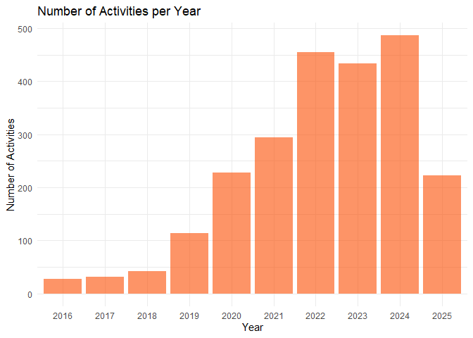
Let’s take a look at my yearly number of activities, bearing in mind that we are missing parts of 2016 and 2025:
From the image below, it’s clear that I started sporting a lot more during COVID19 (2020-2021), but that I kept increasing afterwards when I started working (2021-2022).
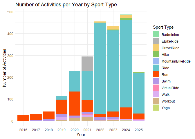
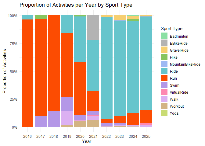
Investigating which types of activities (both as absolute number in the first image and as relative amount in the second), it becomes clear that I made a pretty big shift from running to cycling. In 2021 there is a lot of ebike riding as well, as I spent three months commuting by ebike.
Distance,time and speed
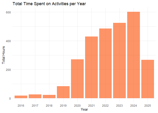
Next, instead of number of activities, let’s take a look at the actual time spent. Here, it becomes clear that while my number of activities did not keep increasing, my time did.
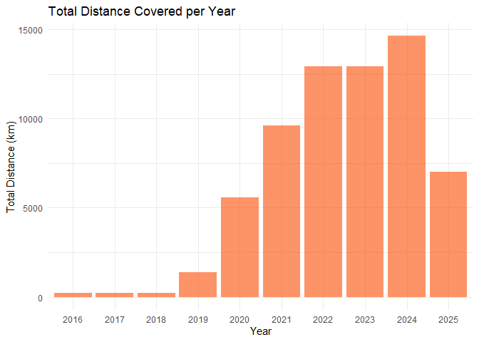
Naturally, as I started cycling more, distance covered per year also increased a lot:
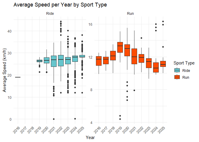
Now, taking a look at my average speed each year for both cycling and running. Starting with cycling, the graph shows my average speed steadily increasing, and interestingly the variance also lowering. A cool thing to spot in the boxplots are the large amount of outliers at 40+ km/h in 2022, the year where I tried out racing at local kermesse crits in Flanders. The data for running also shows an interesting trend. Recall that I started cycling more and more from 2020 onwards? This is also clearly shown here, as the average speeds declines from its peak at 2019. Still, looking at the outliers, my fastest running happened in 2024 and 2025! Not because my running is now in peak form, but because I sometimes attend a 5km fun race organized by my university at which I often (always) go all out.
Heart rate
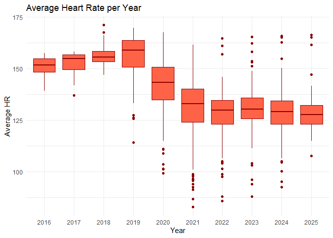
Average heart rate data tells a similar story, illustrated by trending towards a lower average heart rate since I started cycling more. After the drastic drop in average heart rate from 2019 to 2021, it stays quite constant, although I still observe the mean slightly decreasing every year, as does the variation.
The extremes
The table beneath shows some of my most “extreme” stats extracted from Strava:
| category | value | unit | name | sport |
|---|---|---|---|---|
| Fastest Average Speed 🚴️ | 44.2 | km/h | WAOD elite 3 - Waasmunster: 10/14 ronden | Ride |
| Longest Distance 🛣️ | 360.2 | km | PARIS - BRUXELLES | Ride |
| Longest Time ⌚ | 755.0 | minutes | PARIS - BRUXELLES | Ride |
| Highest Average HR ❤️ | 171.0 | bpm | 2018 afsluiten! | Run |
| Kilojoules 🔥 | 10330.2 | kJ | PARIS - BRUXELLES | Ride |
| Most Suffer 😰 | 626.0 | score | Montañas Vacías día 5 | Ride |
| Greatest Elevation Gain ⛰️ | 5282.0 | meters | Granfondo Marmotte des Alpes | Ride |
| Most Kudos 👍 | 78.0 | # | Gran Fondo Espace Cycles Etalle | Ride |
| Most PRs 🏅 | 117.0 | # | Genieten 😍 | Ride |
| Most Comments 🗣 | 17.0 | # | PARIS - BRUXELLES | Ride |
PS: if you are interested why someone would cycle 360km from Paris to Brussels, check out this awesome film by Charles, a good friend of mine who now started his own custom wheel brand: pacq.cc
About the gear
Currently, I own four bikes (oopsie): two race bikes (modern Giant TCR and retro Giant CFR), a gravel bike (Cinelli Zydeco) and a retro MTB (Specialized Hardrock).
First, looking at the relative bike use each year, it is clear that the Cinelli quickly became my favorite bike to ride after I bought it in 2022. I still love my TCR as well, but the Cinelli’s versatility (pannier rack, mudguards, clearance for 40mm tires, disc brakes, …) make it super suited to use all year round and for commuting to work. The TCR on the other hand, is a pure race bike with carbon wheels, rim brakes and clearance for 25mm tires. So after buying the Cinelli, it quickly became the “good weather only” bike.
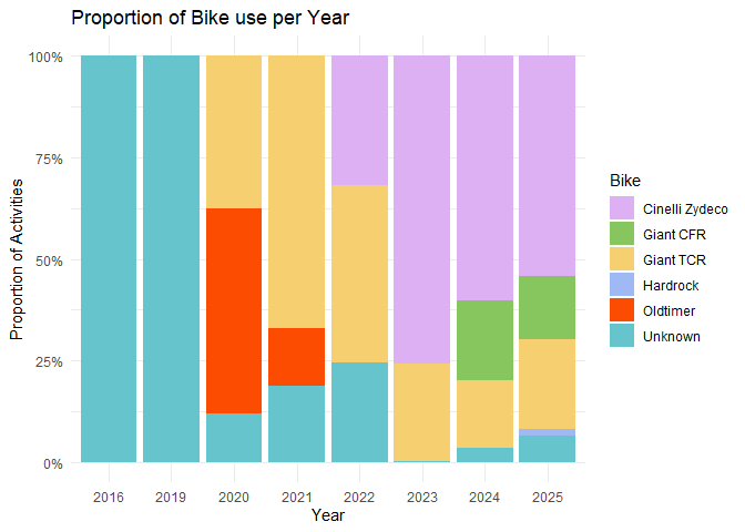
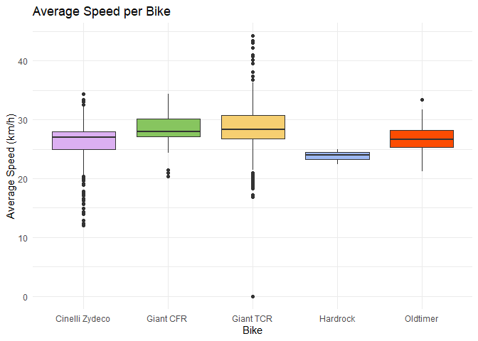
Looking at the average speed per year, we identify some logical patterns and can see that on average, I ride faster with my carbon race bike as compared to my alloy gravel bike (but not much tho!). High and low outliers for respectively the TCR and the Cinelli make sense: TCR is used for racing and I did a few bikepacking trips with the Cinelli.
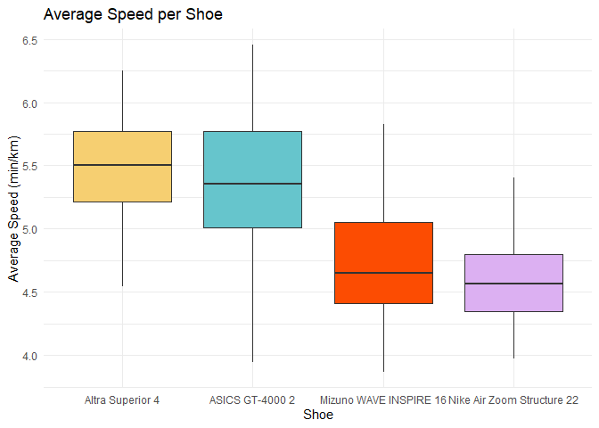
Same for shoes (attention, y-axis is the pace in min/km), so lower is faster!
What’s in a name
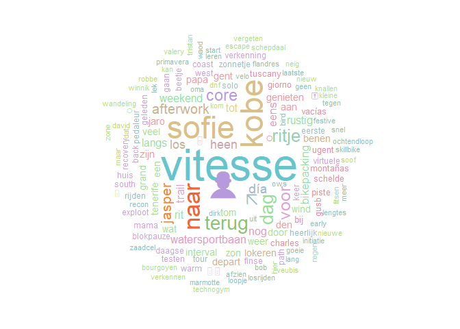
This wordcloud is by far one of my favorite visualizations of the Strava data. The biggest word, “Vitesse” is the name of my cycling club: Vitesse 9000. It’s also nice to see that the name of my girlfriend and the names of some of my best friends pop-up as big words, showing that cycling truly is a social hobby for me.
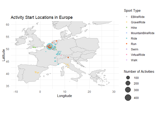
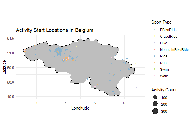
Going places
Finally, I overlayed the start locations of my rides on the maps of Europe and Belgium (the only other countries I used Strava outside Europe would bike Canada and South-Korea).
Conclusion
There is lots of fun stuff to do with the data that can be extracted from Strava. I’m currently working on a simple R tool so anybody can upload there Strava data as .csv to generate a report like this. I might extend it later with more in depth analysis and/or make it interactive, but this might be a long term thing…
The tool is available via: stravaReportR